
THE PURPOSE OF THIS BLOG:
To encourage parents and teachers to read to children (and to educate picture book writers and illustrators about including cognitive elements in their work). The act of reading out loud is not enough. When reading a picture book, or even a middle grade book, we are given a fantastic opportunity to develop an interactive experience with our children.
What is an interactive experience?
This interactive experience does not require any devices. It does require constant interfacing between the adult and the child/children.
When reading to children, you want to deliver the book in a manner that invites the children to participate as active listeners and engages responses from them that grow their minds.
Passive listening is all very well, but the story is soon over, and an opportunity has been lost to use ‘story time’ as a guided exploration of another world, or some subject. I totally understand how often the bedtime story has to be delivered promptly and that there is no time for discussion. I firmly believe however, when possible, an extended period devoted to reading and delving into the text, benefits the child, and is enjoyed by both the adult and the child.
I grew up in the days of cassette tapes. CDs were a novelty in my early teens. As a child, I suffered from chronic asthma which kept me in bed for extended periods. My mother did her best to keep me entertained. One of my greatest joys was listening to a vast collection of cassette tapes – nursery rhymes, stories, music, etc. One of my favourites was Danny Kaye narrating ‘Tubby the Tuba’.
I was so excited to find Tubby in book form, and bought it to entertain my sister’s children and use with my students.
Tubby the Tuba
Written by Paul Tripp
Illustrated by Henry Cole
Published by Dutton Children’s Books, a division of Penguin Young Readers Group, Penguin Group, 345 Hudson Street, New York, New York 10014
The illustrations appear to be mixed media.
This fiction book is perfect for children aged 3 to 8, but brings much nostalgic joy to this adult too. The book is accompanied by a CD and is narrated by the author, Paul Tripp. The music was composed by George Kleinsinger. The melodious soundtrack was performed by the Radio Orchestra of Bratislava, Slovakia, and was conducted by Stephen Gunzenhauser.
Summary:
Tubby, a tuba, feels sad as he never plays a pretty melody with the orchestra. He just ‘oompahs’ a rhythm.
The History Behind ‘Tubby the Tuba’:
According to Wikipedia, the Tubby song traces its origins back to World War II, following the attack on Pearl Harbor. After Paul Tripp and George Kleinsinger performed their first musical piece, the tuba player quipped: “You know, tubas can sing, too.” With this in mind, Tripp wrote the tale of a tuba who found a melody to play, and the pair then made a song out of it. It was not until the war ended that they finally had a hit with “Tubby”.
Lessons to be learnt from this fantastic book:
- Auditory Discrimination – When children listen to the recording, while reading along in the book, they will hear the different sounds and tones of some of the different instruments of the orchestra. If the children listen to the recording several times, prompt them to try to name the instruments playing. They will learn to differentiate the sounds and also to remember them. When they listen to other orchestral/classical music, they may then be able to recall the sound of the instrument and correctly identify it in other pieces of music. It is important that children develop auditory discrimination – it is vital for learning spelling and reading (encoding and decoding words).
- Musical Appreciation – Many children are not exposed to orchestral or classical music nowadays. Using a book like ‘Tubby the Tuba’ can be a great way to introduce children to a musical genre with which they are not familiar.
- Vocabulary Development – As the sounds of the musical instruments are introduced, so are the names of the instruments, as well as other musical terms and words associated with orchestral music, like: scales, melody, conductor, baton, etc. The book also contains lovely words like quivered, indignation, audience, rehearsal, disgrace, snickered, etc.
- Personal Conviction – This story is a great way to help children when discussing how they should maintain personal convictions (standing up for themselves) and how to manage situations when they are being belittled by others.
For writers:
- Text Is Very Active – This story is a good example of ‘showing not telling’. There is dialogue, but very little description.
- Advanced Vocabulary – Use words required to best tell the story, but always use them in context. The illustrator can assist with the explanation through the illustrations.
- Onomatopoeia – Onomatopoeia is another device for helping to ‘tune-in’ children’s ears to sounds (phonemes). They often like to mimic the sounds too. Paul Tripp used sounds like: shhhhhh, oompah, tinkled, hooted, bug-gup, ahem, etc. Onomatopoeia words sound like the sounds they make. Onomatopoeia also helps maintain attention to the story. Children love sound effects. If the paired reader can read ‘with feeling’, the sound effects entice the children to listen more carefully.
For illustrators:
- Bold Outlines – All characters in the foreground have bold black outlines, whereas the background settings have either much finer black outlines or just a pencilled outline. It is easy for the readers to determine the focal point.
- Dynamic Characters –Character expression and body language is the focus of the illustrations. Colours are kept clean and simple and there is no distracting texture. The story is about characters and so are the illustrations. Background and setting is minimal too.
About the writer:
Paul Tripp lived from February 20, 1911 to August 29, 2002. He was an American children’s musician, author, songwriter, and television and film actor. He collaborated with a fellow composer, George Kleinsinger. Tripp was the creator of the 1945 “Tubby the Tuba”, a piece of classical music for children that has become his best-known work. He authored several books, including Rabbi Santa Claus and Diary of a Leaf.
About the illustrator:
Henry Cole is a self-trained American illustrator. He has illustrated over one hundred picture books.
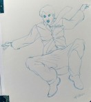
For those of you new to my blog, I blog about my illustration journey (I am working on a new picture book at the moment, so am sharing as I go along), and review picture books (to share how cognitive elements can be drawn from the book to educate the child, and also how writers and illustrators can incorporate these elements in their work).
At the moment, I am trying to produce one of each blog per month. Please join me again next month.
Happy reading!
Links to the other Tubby stories:


You must be logged in to post a comment.